
Bitcoin’s recent price action has been nothing short of exhilarating, but beyond the market buzz lies a wealth of on-chain data offering deeper insights. By analyzing metrics that gauge network activity, investor sentiment, and the BTC market cycles, we can gain a clearer picture of Bitcoin’s current position and potential trajectory.
Plenty Of Upside Remaining
The MVRV Z-Score compares Bitcoin’s market cap, or price multiplied by circulating supply, with its realized cap, which is the average price at which all BTC were last transacted. Historically, this metric signals overheated markets when it enters the red zone, while the green zone suggests widespread losses and potential undervaluation.
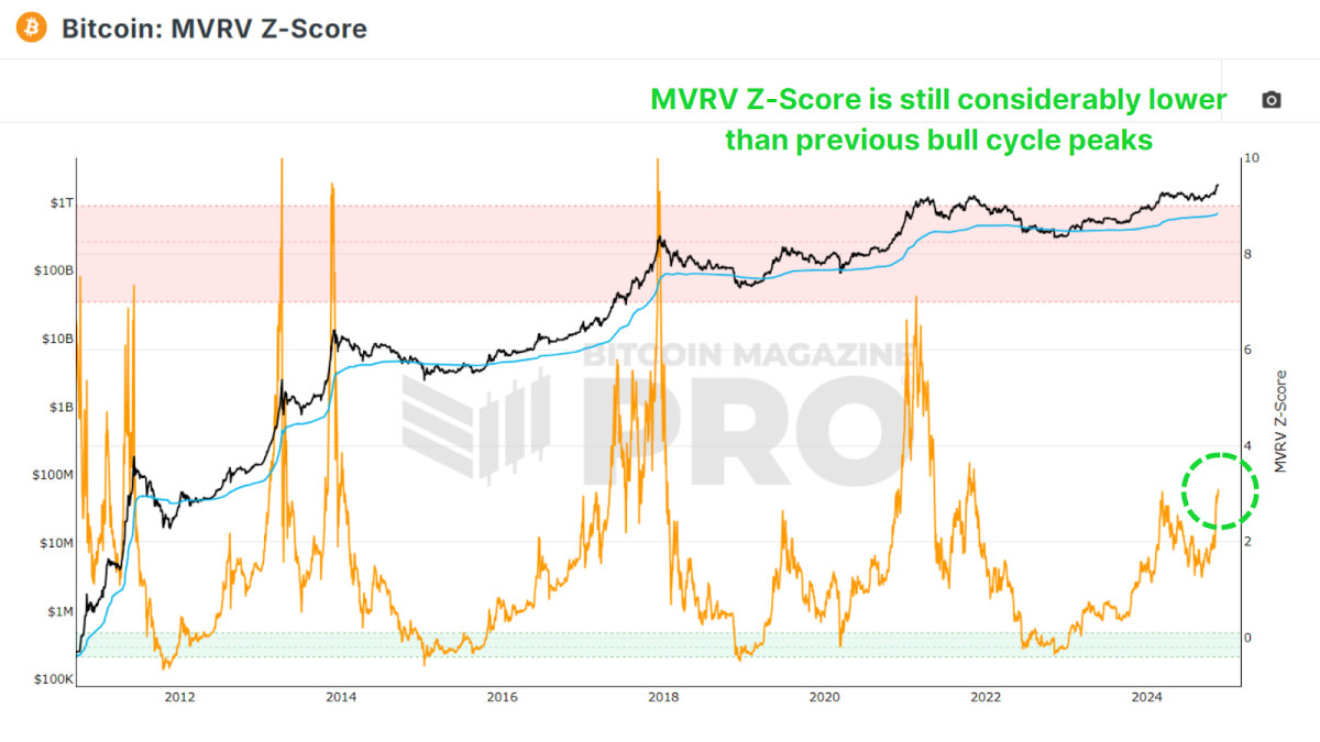
Currently, despite Bitcoin’s rise to new all-time highs, the Z-score remains in neutral territory. Previous bull runs saw Z-scores reach highs of 7 to 10, far beyond the current level of around 3. If history repeats, this indicates significant room for further price growth.
Miner Profitability
The Puell Multiple evaluates miner profitability by comparing their daily USD-denominated revenue to their previous one-year moving average. Post-halving, miners’ earnings dropped by 50%, which led to a multi-month period of decreased earnings as the BTC price consolidated for most of 2024.
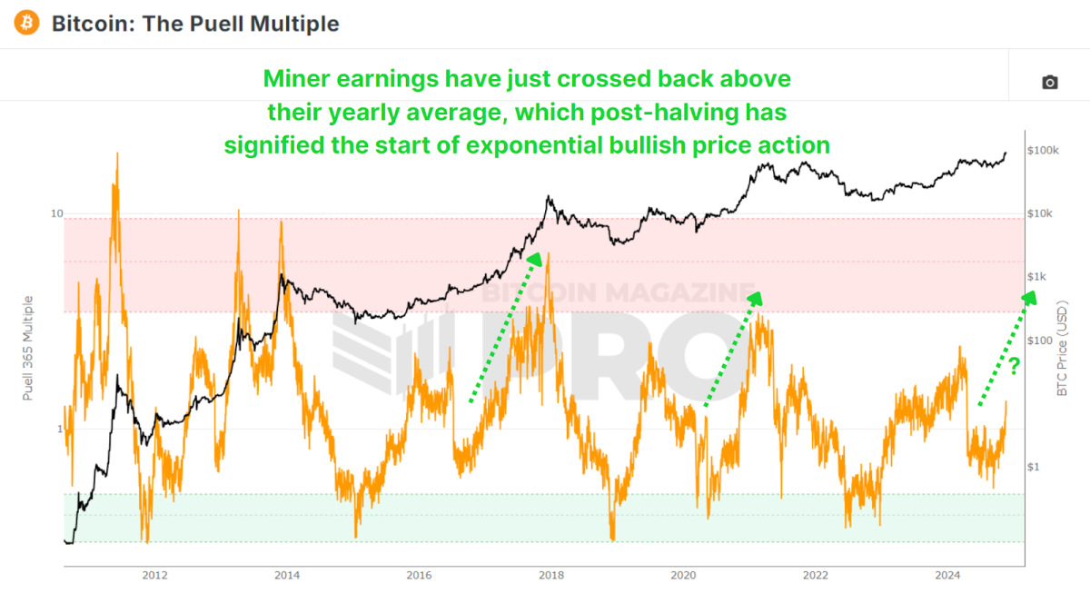
Yet even now, as Bitcoin has skyrocketed to new highs, the multiple indicates only a 30% increase in profitability relative to historical averages. This suggests that we are still in the early to middle stages of the bull market, and when comparing the patterns in the data we look like we have the potential for explosive growth akin to 2016 and 2020. With a post-halving reset, consolidation, and a finally a reclaim of the 1.00 multiple level signifying the exponential phase of price action.
Measuring Market Sentiment
The Net Unrealized Profit and Loss (NUPL) metric quantifies the network’s overall profitability, mapping sentiment across phases like optimism, belief, and euphoria. Similar to the MVRV Z-Score as it is derived from realized value or investor cost-basis, it looks at the current estimated profit or losses for all holders.
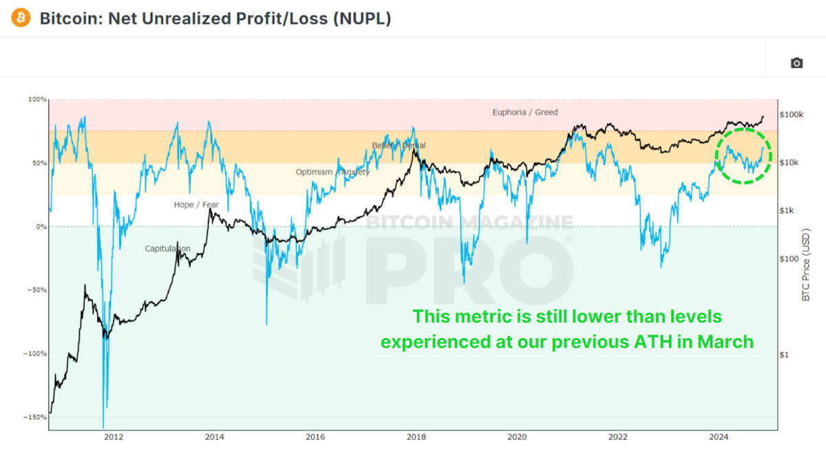
Presently, Bitcoin remains in the ‘Belief’ zone, far from ‘Euphoria’ or ‘Greed’. This aligns with other data suggesting there is ample room for price appreciation before reaching market saturation. Especially considering this metric is still at lower levels than this metric reached earlier this year in March when we set out previous all-time high.

Long-Term Holder Trends
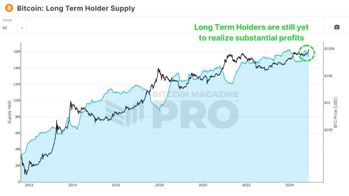
The percentage of Bitcoin held for over a year, represented by the 1+ Year HODL Wave, remains exceptionally high at around 64%, which is still higher than at any other point in Bitcoin history prior to this cycle. Prior price peaks in 2017 and 2021 saw these values fall to 40% and 53%, respectively as long-term holders began to realize profits. If something similar were to occur during this cycle, then we still have millions of bitcoin to be transferred to new market participants.
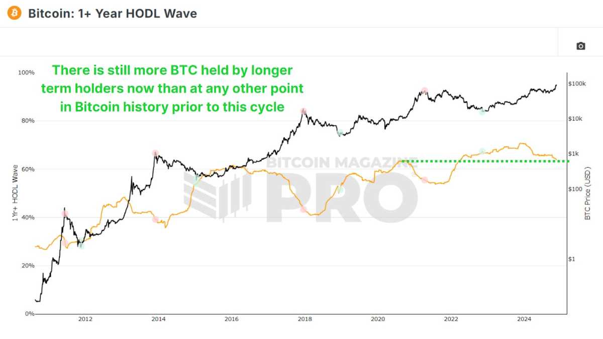
So far, only around 800,000 BTC has been transferred from the Long Term Holder Supply to newer market participants during this cycle. In past cycles, up to 2–4 million BTC changed hands, highlighting that long-term holders have yet to cash out fully. This indicates a relatively nascent phase of the current bull run.
Tracking “Smart Money”
The Coin Days Destroyed metric weighs transactions by the holding duration of coins, emphasizing whale activity. We can then multiply that value by the BTC price at that point in time to see the Value Days Destroyed (VDD) Multiple. This gives us a clear insight into whether the largest and smartest BTC holders are beginning to realize profits in their positions.
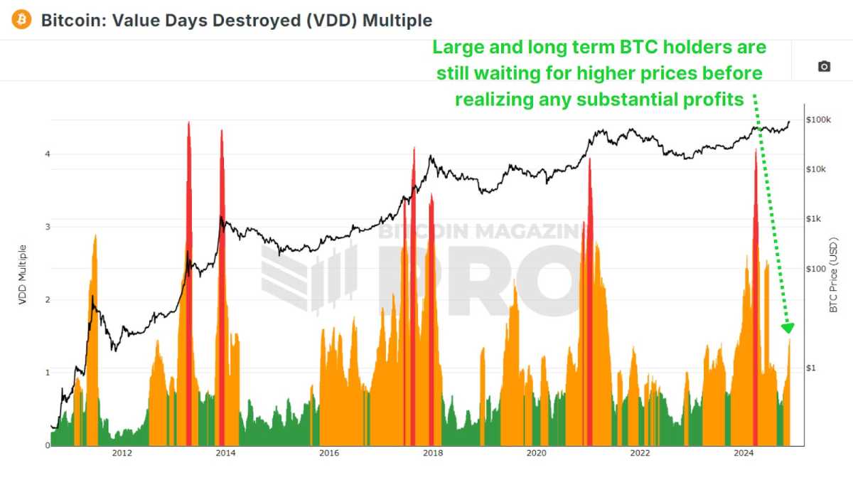
Current levels remain far from the red zones typically seen during market tops. This means whales and “smart money” are not yet offloading significant portions of their holdings and are still awaiting higher prices before beginning to realize substantial profits.
Conclusion
Despite the rally, on-chain metrics overwhelmingly suggest that Bitcoin is far from overheated. Long-term holders remain largely steadfast, and indicators like the MVRV Z-score, NUPL, and Puell Multiple all highlight room for growth. That said, some profit-taking and new market participants signal a transition into the mid to late-cycle phase, which could potentially be sustained for most of 2025.
For investors, the key takeaway is to remain data-driven. Emotional decisions fueled by FOMO and euphoria can be costly. Instead, follow the underlying data fueling Bitcoin and use tools like the metrics discussed above to guide your own investing and analysis.

For a more in-depth look into this topic, check out a recent YouTube video here: What’s Happening On-chain: Bitcoin Update


